
How to Design With Elements That Make Branded Merchandise Truly Stand Out
Learn how to design with elements that elevate your branded merchandise. Expert tips for Australian marketing teams, businesses, and sports clubs.

Written by
Dane Santos
Branding & Customisation
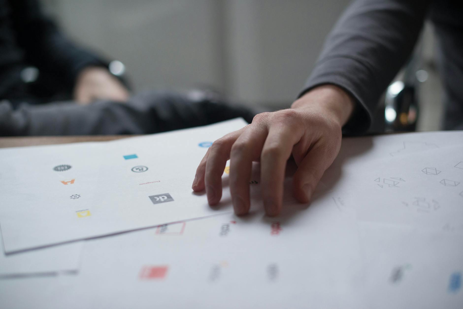
Choosing the right products for your branded merchandise campaign is only half the battle. The other half — arguably the more important half — is how you design them. Whether you’re a marketing manager in Sydney briefing a supplier for an upcoming conference, a Brisbane sports club ordering custom kit for the new season, or a Melbourne business sourcing corporate gifts for end-of-year, the design decisions you make will determine whether your merchandise gets used every day or ends up forgotten in a drawer. Understanding how to design with elements that communicate your brand effectively is one of the most valuable skills you can develop as someone who commissions promotional products.
Why Design Elements Matter More Than You Think in Branded Merchandise
It’s easy to underestimate the role that design plays in the success of a branded merchandise campaign. Many organisations focus heavily on product selection and budget, then rush the artwork stage at the last minute. The result? Merchandise that looks generic, feels disconnected from the brand, and fails to create the impression it was meant to leave.
Great branded merchandise design is the product of deliberate decisions about every visual element — colour, typography, layout, logo placement, scale, and negative space. When these elements work together cohesively, your branded item becomes a miniature billboard that people actually want to carry, wear, or use. When they don’t, even a high-quality product can feel cheap or confusing.
This matters because promotional merchandise is a long-term brand touchpoint. A well-designed branded keep cup used every morning in an Adelaide office generates thousands of impressions over its lifetime. A poorly designed one might end up in the bin after a week. The design is what makes the difference.
Understanding the Core Design Elements for Merchandise
Before diving into practical application, it helps to understand what we mean when we talk about design elements. In the context of branded merchandise, the key elements include:
- Logo and branding marks — your primary visual identifier
- Colour palette — including your brand’s primary and secondary colours, and how they translate across different materials and decoration methods
- Typography — your chosen fonts and how they render at small sizes or in stitched embroidery
- Imagery and icons — supplementary graphics, patterns, or illustrations
- Taglines or messaging — short copy that supports the visual design
- Negative space — the deliberate absence of design, which gives the eye room to breathe
Understanding how each of these elements behaves on a physical product — rather than on a screen — is central to creating merchandise that genuinely works.
How to Design With Elements for Different Decoration Methods
One of the biggest mistakes organisations make is designing for merchandise the same way they design for digital media. A logo that looks crisp on a website might be completely unsuitable for embroidery on a polo shirt. A four-colour gradient that renders beautifully on a brochure might not survive a pad printing process. Your design elements need to be adapted for the specific decoration method being used.
Screen Printing
Screen printing is one of the most common decoration methods for custom apparel, including t-shirts, hoodies, and tote bags. Each colour in your design requires a separate screen and incurs additional cost, so designs that use fewer spot colours tend to be more cost-effective. When designing with elements for screen printing, simplify your palette, avoid gradients, and make sure fine details are bold enough to hold at the intended print size. Our guide to t-shirt graphic design principles goes deeper into how to adapt your artwork for apparel printing.
It’s also worth noting that screen printing works best with vector artwork. If you’re not sure about file types, our explainer on what is a vector art file is essential reading before you submit artwork to any supplier.
Embroidery
Embroidery is the preferred decoration method for premium corporate apparel — think work polo shirts, caps, and branded jackets. When designing for embroidery, your elements need to be simplified significantly. Fine lines, small text, and complex gradients simply cannot be replicated in thread. Embroidery works best with bold shapes, clear outlines, and a limited colour count.
Many organisations opt for a simplified version of their logo for embroidery applications — sometimes called an embroidery-specific lockup. This is a smart approach and worth discussing with your supplier early in the process.
Sublimation Printing
Sublimation allows full-colour, edge-to-edge designs and is popular for sportswear, custom towels, and some drinkware. When you design with elements for sublimation, you have much more creative freedom — gradients, photographic imagery, and complex patterns are all achievable. However, sublimation only works on white or light-coloured polyester-based substrates, which is a constraint you need to factor into your product selection.
Laser Engraving and Pad Printing
Laser engraving is common for premium corporate gifts — think metal drink bottles, USB drives, and awards. Designs are rendered in a single colour (the engraved material itself), so simplicity is key. Pad printing, used on hard promotional items like pens and phone accessories, also works best with clean, bold elements and minimal fine detail.
Practical Tips for Designing With Elements Across a Full Merchandise Range
When you’re sourcing a suite of branded merchandise — say, for a major conference in Perth or a corporate gifting programme across multiple Australian offices — you’ll often be designing across multiple products simultaneously. Here’s how to approach that with consistency and efficiency.
Establish a Merchandise-Specific Design System
Rather than adapting your brand guide on the fly, consider creating a merchandise-specific design system before you start briefing suppliers. This should include:
- Approved colour codes in both PMS (Pantone Matching System) and CMYK/RGB formats
- Approved logo versions — full colour, single colour, reversed (white on dark), and simplified embroidery lockup
- Minimum clear space rules for how your logo sits on a product
- Font usage guidelines — including alternatives if your primary brand font isn’t available for merchandise decoration
Having this ready before you approach suppliers saves significant time and reduces the risk of inconsistencies across your product range.
Scale and Placement Are Everything
A design element that looks proportional on a piece of A4 paper may look tiny on the back of a hoodie or oversized on the side of a pen. Always work in the actual dimensions of the product you’re decorating, and ask your supplier for a template or product brief showing the print or embroidery area.
For larger items — like tear drop banners or display signage — scale becomes even more critical. Designs intended for small branded items often need to be completely reworked to translate to larger format applications.
Proofing Your Design Before Production
No matter how carefully you’ve constructed your design elements, always request a proof before approving production. Digital proofs (virtual mockups) give you a quick visual reference, while physical samples offer the most accurate representation of the finished product. Our comparison of virtual proofs vs physical samples explains when each is appropriate and how to use the proofing process to your advantage.
For large orders — anything over 500 units — a physical sample is almost always worth the additional time and cost. It’s much less expensive to identify a design issue before production than after.
Design Elements for Specific Product Categories
Different product types present unique design opportunities and constraints. Here’s a brief overview of how to think about design across some of the most popular merchandise categories.
Drinkware
Branded drinkware — including keep cups, metal water bottles, and mugs — typically offers a curved print surface, which affects how your design elements wrap and align. For cylindrical products, consider how your design reads from multiple viewing angles. Simple, bold designs tend to work better than complex arrangements. If you’re selecting materials with sustainability in mind, understanding BPA-free labelling is also worth considering. For a deeper dive into product selection, our guide to the best water bottle brands covers what to look for beyond the design.
Bags and Totes
Totes and backpacks offer generous print real estate, making them ideal for bolder design elements. A large tote bag from a Gold Coast sustainability event, for example, might feature a full-front print with a striking pattern plus the brand logo — an approach that wouldn’t work on a pen or a cap. When designing for bags, think about how your elements look when the bag is carried — not just when it’s laid flat.
For organisations interested in reducing their environmental footprint, pairing strong design with sustainable product choices is a powerful combination that resonates strongly with today’s audiences.
Tech Accessories and USB Drives
Branded tech accessories — including USB promotional drives and novelty options like custom USB flash drives — have very small print or engraving areas. Your design elements need to be stripped back to the essentials: typically just your logo, and perhaps a web address. Trying to include too many elements on a small tech product is one of the most common briefing mistakes.
Seasonal and Event Products
For seasonal campaigns, like Christmas gifts for employees or winter promotional products, your design elements might incorporate seasonal colour palettes or visual themes alongside your core brand. This can be effective, but maintain enough brand consistency that the product is still clearly from your organisation. Seasonal design elements should complement your brand — not overwhelm it.
Similarly, for event-specific merchandise like event wristbands or branded wristbands, design simplicity is often dictated by the product itself. Work within those constraints rather than against them.
Conclusion: Key Takeaways for Designing Branded Merchandise That Works
Learning to design with elements deliberately and strategically is what separates forgettable merchandise from branded products that genuinely build recognition and loyalty. Whether you’re ordering wholesale umbrellas for a Sydney trade show, promotional umbrellas for a corporate event, or gym towels for a fitness-focused gifting campaign, the same principles apply: be intentional, be consistent, and always adapt your design for the specific product and decoration method.
Here are the key takeaways to carry into your next merchandise project:
- Design elements must be adapted for each decoration method — what works for screen printing won’t necessarily work for embroidery or laser engraving
- Always work in vector format to ensure your artwork scales and reproduces cleanly across every application
- Establish a merchandise-specific design system before briefing suppliers to ensure consistency across your full product range
- Request proofs at every stage — especially for large orders — and use the proofing process to catch issues before they become expensive production problems
- Scale and placement matter enormously — always brief and review designs in the actual dimensions of the product, not on a standard document page
- Simplicity usually wins — the most effective branded merchandise tends to feature clean, confident design rather than cluttered, overcomplicated artwork
With the right approach to design, your branded merchandise becomes far more than a giveaway. It becomes a genuine expression of your brand that people want to use, keep, and show off — and that’s exactly what great promotional products are meant to do.